No School Closures Design Project
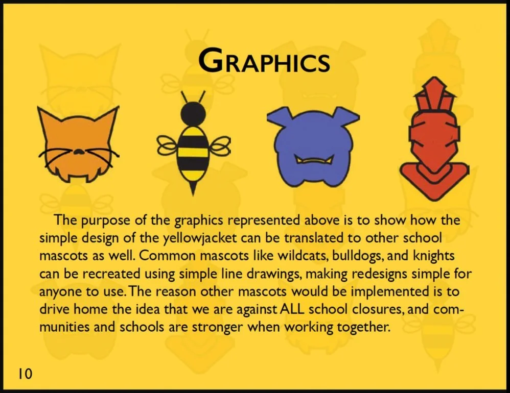
During my time at Hunter College, I faced a semester-long project that asked me to choose a cause I am passionate about and design a mock campaign around said cause. My choice was public schools, specifically the prevention of school closures. This was something very close to me at the time, and my inspiration for the mock campaign was the real closure of Oak Hill, the K-8 school several generations of my family (including myself) had attended.
The Poster
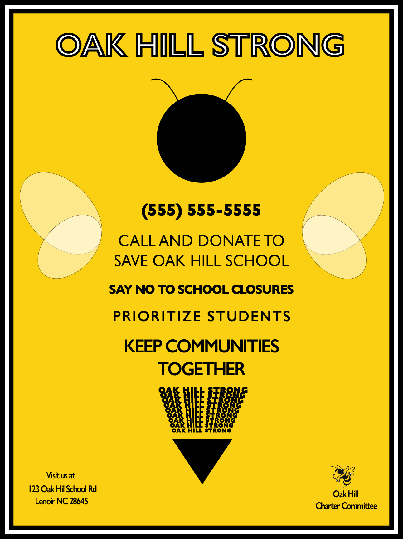
Step one was creating a poster for our campaign. I chose to center mine around the yellow jacket, Oak Hill’s former mascot. My aim was to create something graphic and easy to read using bold color blocking and a legible typeface.
Color
#FBD013
Type
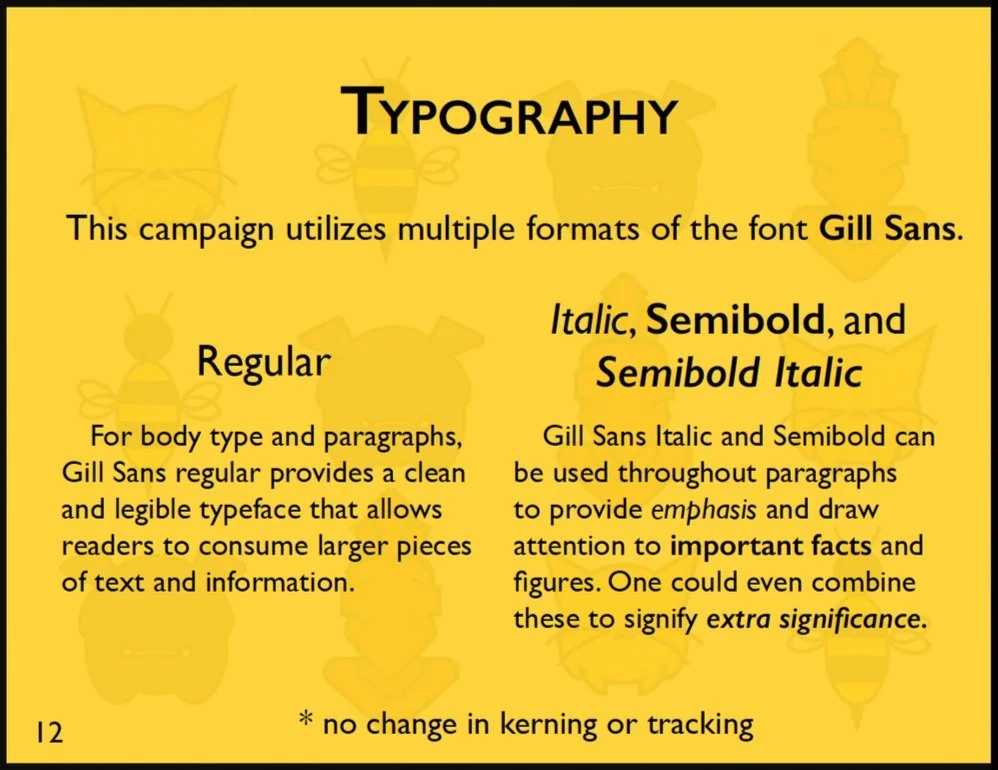
Gill Sans
Gill Sans SemiBold
Tools
Shape Builder
Text Blending
Stroke/Fill in the Appearance Window
2. The Standards Manual
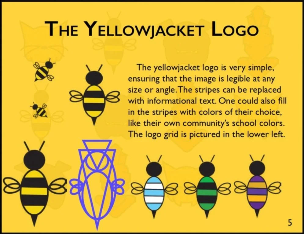
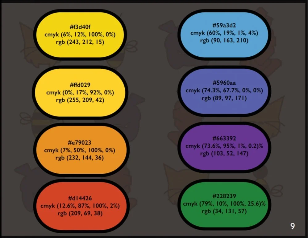
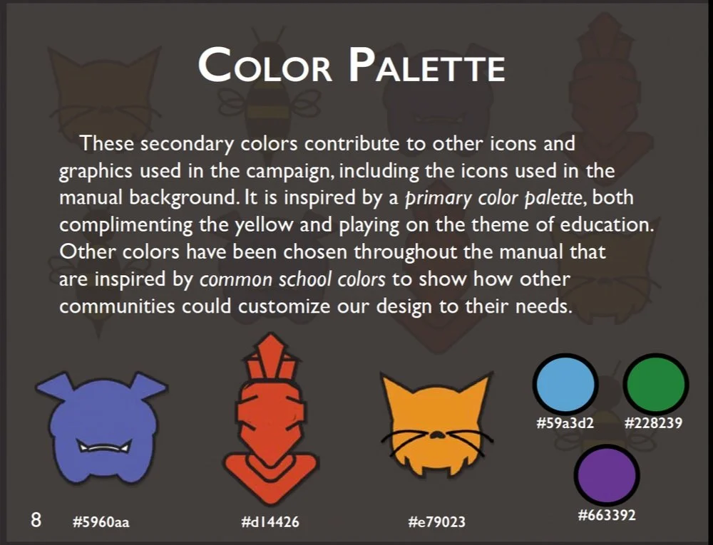
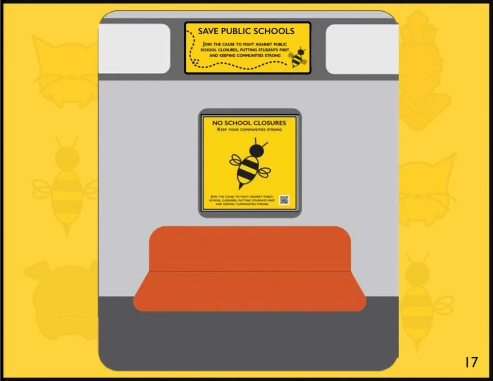
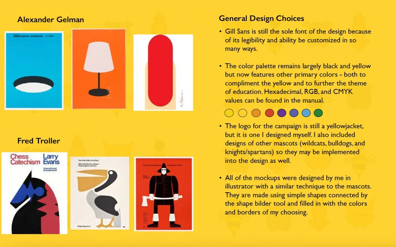
The standards manual for our mock campaign was meant to flesh out our design and create a theme and a consistent image. I was able to identify colors, shapes, and type that remained consistent throughout the project, and could always be referred back to using the manual. You can download and view the full manual or the more summarized brief by selecting their headers below on the left.
The Brief
The Manual
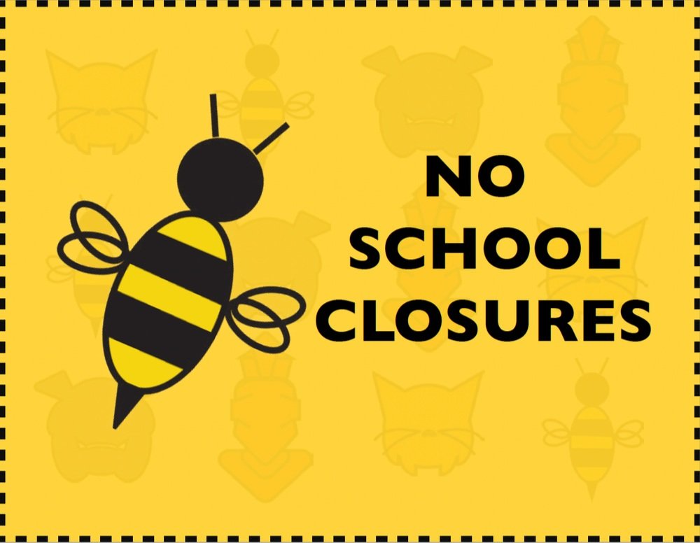
Front Cover
Back Cover
The brief uses the same design elements (color, type, background) as the manual, though it is more concise and less overt. Its purpose is to briefly (of course) list the main points of the manual, sans the advertising mockups.
This manual was created using Adobe InDesign. I made the background using colors and graphics that are present throughout the entire document.